

Last week I tweeted out an idea for a remodeled 7th St / Metro Center Station, so I’m adding it to the blog as well.
Design Elements
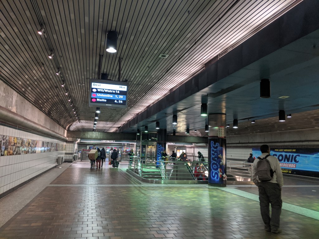
I generally like the existing station, but I feel like it could be brighter and have much better wayfinding signage. The new design focuses on both of those elements. New ceilings would be painted a lighter color or have reflective panels like those seen in the London Underground tunnels. The floors would also be replaced by a light colored epoxy that is easy to clean and works well for high-traffic areas like train stations.
To add some color, the middle part of the ceiling would be given a wood-like treatment that provides a bold contrast against the light gray ceilings. Lighting would also be adjusted to ensure adequate brightness.
Electronic Signage
Underground Metro stations typically provide older TV monitors with dark colored graphics. The signs can only display limited information about upcoming trains and often rotate between different messages. The display is also small, so station names have to be condensed to fit. As a passenger, the messages can come across as incomplete and cause frustration when waiting for information about your train.
As part of the blue line A Line (Blue) renovation, Metro recently unveiled interactive touch screens which allow users to plan routes and find connections to their final destination. These screens are an important update to stations, but do not replace the need for better and consistent display systems on platforms and throughout stations.
So I propose these new signs which would add more screens and display all the information passengers need. Different displays can be used for entrances to the stations, transfer points within the station, and on platforms to show information relevant to passengers at that point in the station.
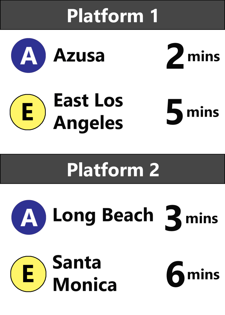
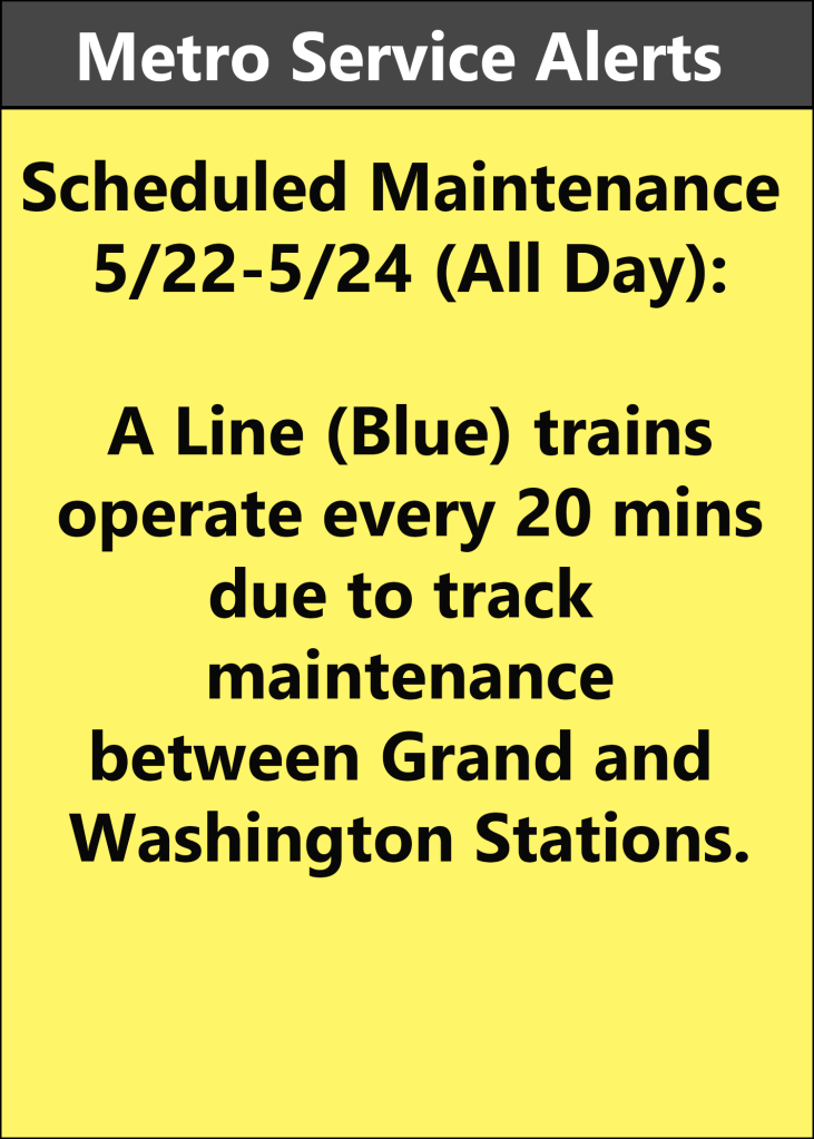
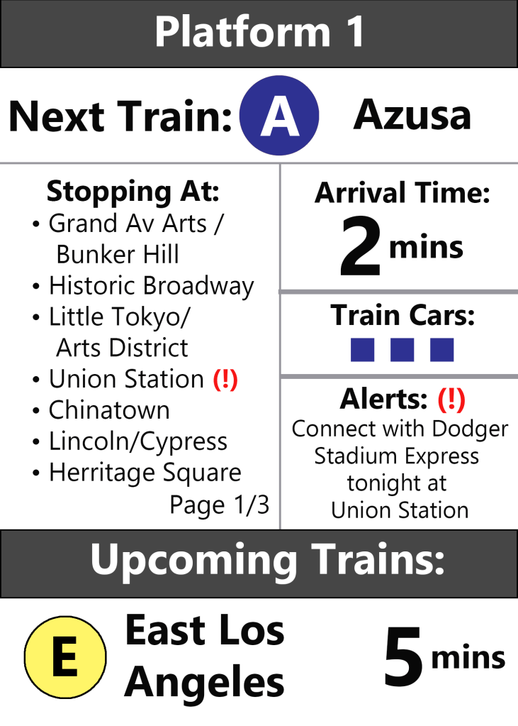
For example, outside the station passengers will want to know what train lines are at the station, where they go, any system alerts, and when the next train comes. At the transfer points, the most important information is where the train platform is, alerts, and when the next train arrives. At the platform, it’s all of the above but with a greater focus on individual stations and details about the train, such as how many cars it consists of and how full they are. These designs try to cater to each element of the passenger experience.
Non-Electronic Signage
In addition to the electronic signage, other signs should be provided indicating how to get to and from each platform. A large station like 7th Street / Metro Center can get confusing because there are multiple levels with many exits and four platforms. Signs can help prevent people from coming up the wrong side when transferring between the subway and light rail services or to leave the station at their desired street.
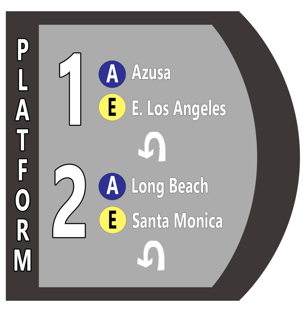
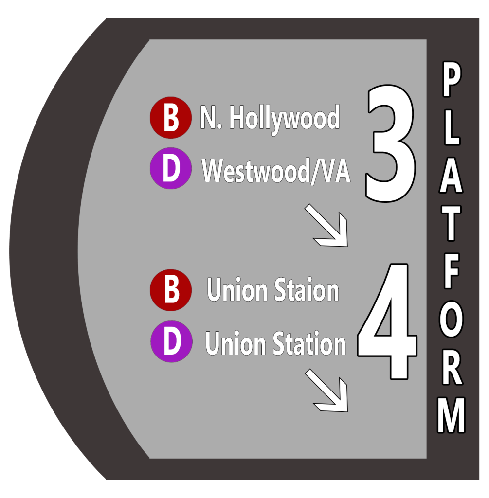
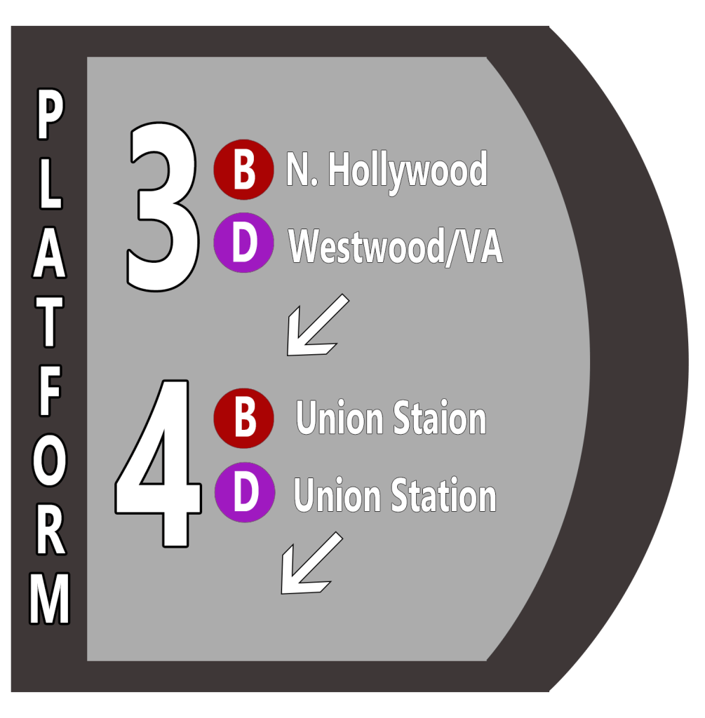
These signs are simple, but would do a lot to help people navigate the station. Especially for non-regular users of the system like tourists or people coming downtown for various events (when we have those again).
Other Upgrades
The changes I focused on are simple, relatively inexpensive improvements that would enhance the passenger experience. But there are lots of other structural and programmatic changes that should be considered as well. These might include:
- Public bathrooms. These are essential and it’s frustrating that there is basically only one stop, Union Station, in the entire system that has them. (There may be a few others, but no more than five total throughout the 90+ station system).
- Drinking fountains. Again, basic amenity but lacking at most Metro Stations.
- Metro Clean Team. I wrote about this idea a while ago and I still think it’s a good one. Basically hire teams of people to regularly clean stations and trains throughout the day.
- Metro Transit Ambassadors. Casually dressed Metro staff (I’m talking t-shirts and jeans or polos and khakis kind of casual) that just assist people with navigating the system, purchasing and using TAP cards (if transit isn’t free), identifying people who may and calling security when absolutely necessary (thus vastly reducing, if not eliminating, police presence at stations). You’ll see transit ambassadors sometimes during major events, but it would be great to have them more regularly and to expand their role. Fun fact: if you stand at a Metro station in a bright colored vest, someone will ask you a question within five minutes (at least in my personal experience).
- Accessibility improvements. Fortunately our stations are all wheelchair accessible, but what improvements can we make to enhance their accessibility even more? How can deaf or blind people access the system? This could look like adding chairs, so people wont have to stand for 15 minutes while waiting for a train, or adding additional tactile pavement to help the visually impaired navigate the station.
- Multi-lingual Everything. The signs I made are all in English, but the final versions should absolutely include multiple languages. I read somewhere over 200 languages are spoken in the City of Los Angeles, so why not include at least some of those in the stations? Especially Spanish which is spoken by millions of people in the region.
- Station Icons. I really like this idea (Credit to @kmacfromla on Twitter) and think it would further help accessibility for people who can’t read or don’t know English. I imagine this station could use the spire on top of the Wilshire Grand for its logo since that is one of the major nearby destinations.
- Station Vendors. Many global cities have stores selling stuff like snacks and electronics (headphones, phone chargers, etc.) in train stations. It makes the station more lively and an enjoyable part of the trip. Plus Metro can charge vendors rent for the space which raises funds for the system. With the addition of bathrooms and cleaning crews, eating and drinking won’t need to be completely banned anymore. That means more flexibility and options for passengers and one less thing to enforce.
- Bike Rails on Stairs. Some cities with better bicycle infrastructure than LA have little bike rails that are on the side of stairways. These rails allow passengers to roll bikes up and down stairways with ease.
- Station Announcements and Music. The station announcements are already pretty good, but could be improved with a better sound system for clarity. Especially when there are closures and someone has to make the announcements live. I also like the idea of trains playing a pleasant tune as they arrive/depart. Each line could even have their own tune. Tokyo does it, why can’t we?
In conclusion, 7th St / Metro Center is one of the most vital rail stations in all of LA County. It should be designed in a way to be more user-friendly, provide essential information about the transit system, help passengers feel safe through design, and include basic, clean public amenities for everyone.
